Shot Charts – Free and Fun
These are player shot charts for the Championship and Premier League last season. They should be (mostly) self-explanatory.
Link here: https://mbertin.shinyapps.io/shotChart
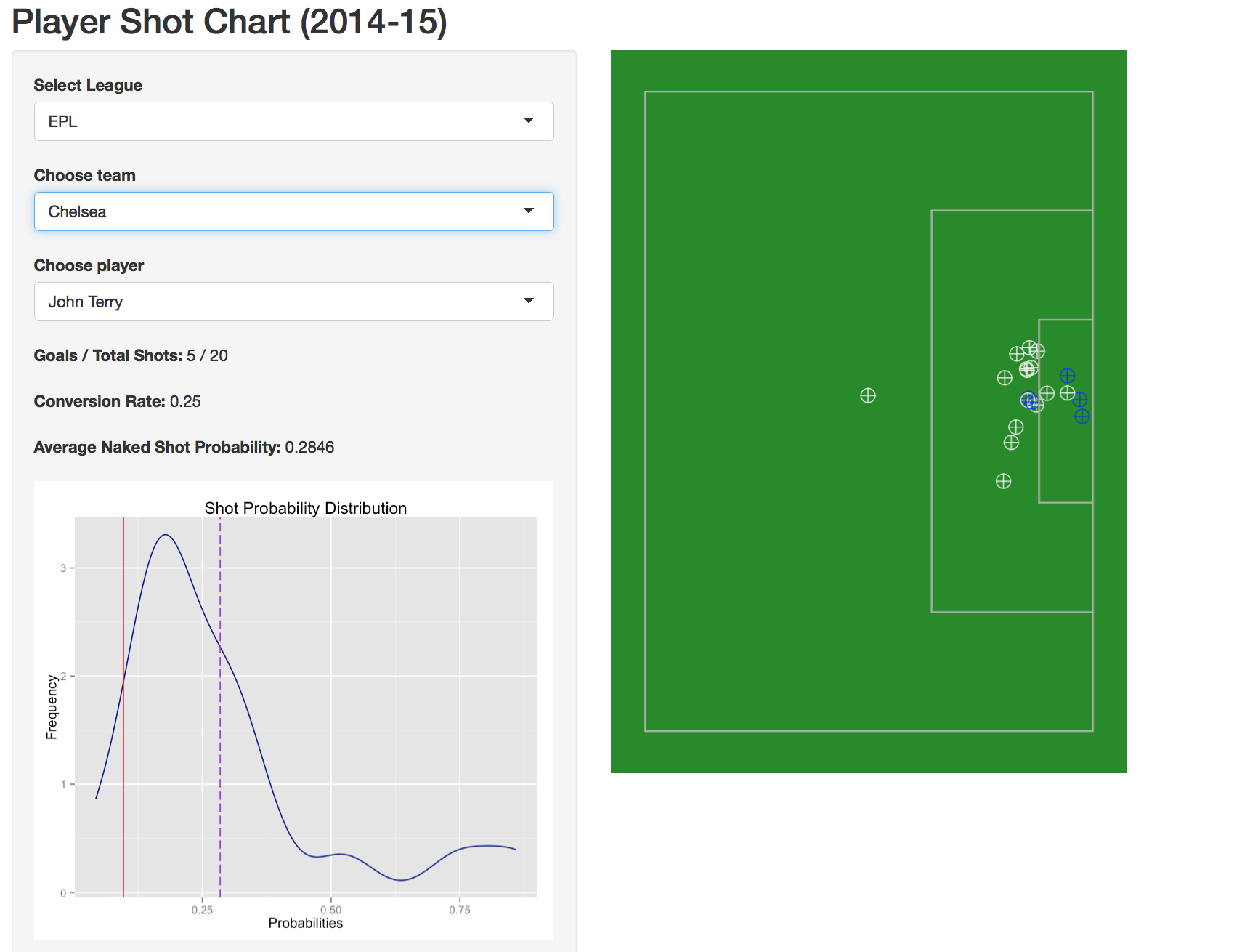
Blue crosshairs are goals; whites are misses. A player’s conversion rate is just his goals divided by the number of total shots. The last number, Naked Shot Probability (NSP), is a metric based on the location of the shot. It’s basically the information in a shot that the player himself controls. It’s a pretty naive metric but it’s a decent indicator of the extent to which a player is getting into dangerous locations, if at all.
The same NSP info is plotted in the distribution. The red line is the average shot probability for both leagues. The dotted purple line is the selected player’s NSP. Pay attention as the graph re-scales for every player. That’s the default behavior (and I left it as such). Moreover, I didn’t bother with the plot for players with fewer than 20 shots.
This isn’t super rich. It was originally intended as a basic proof of concept. The ultimate goal was to have all of the important info in each shot so that when you hovered over an individual one, it you would get a tooltip with things like distance, ExpG value, clock time of shot, on/off-target, deadball/open play, or any number of other interesting bits of info. Unfortunately, all of the javascript libraries that are compatible with Shiny are not really production ready (I tried both rCharts and ggvis, both to frustrating results). But this still works, so I thought I’d make it available.
Apologies if it doesn’t load1. The free version of Shiny limits the total amount of monthly usage time. If you hit the limit, it won’t load until the next monthly cycle starts and re-zeros the time clock. It might also limit the number of simultaneous connections. If your life absolutely depends on being able to see a plot, find me on Twitter or something. I have a copy up on AWS that I can send you a temp link for.
It is also purely coincidence that it defaults to Steven Gerrard the season he became terrible. Funny, but coincidence. And while I despise John Terry, that graph above is a thing of beauty.
1 Also, for some reason I couldn’t get the page the load in Firefox, but it loaded fine the first time I tried it in Safari. So if you think it might be a browser issue and not a usage/timeout issue, let me know and I’ll troubleshoot.