Spaghetti Plot
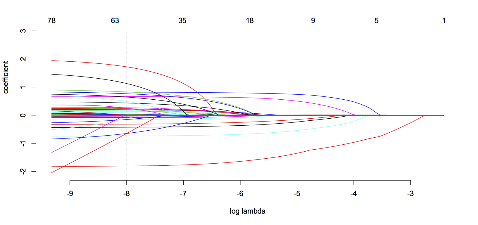
This is a plot of all the variables in the model, as well as a plot of all the candidate models. You read it from right to left.
Think of this a determining a signal-to-noise ratio.
At the far right, we have pure signal. But we also have no variables in the model (nothing is just signal; there is some deviance with everything). As we move left, we start letting stuff in the model—you can see when something enters the model when its colored line ‘escapes’ the horizontal—but that comes with increased noise. So model selection is basically figuring out how to tune the amount of signal you want at the cost of how much noise you willing to allow.
Anyway, on the far right, that first red line to drop down? That’s the line for distance (how far the shot was from goal) and that’s the graphical representation of how it’s the first thing to enter the model (the dotted vertical line is for the selected model, where it cuts through all the coefficients, that’s their value on the other page). Think it’s worth repeating that most of the information in an ExpG calculation is in the distance. So for all of the fancy math here, if all you know is how far the shot was from goal, you can make a not-terrible ExpG model. In fact there are instances where I prefer this naive metric because it tells us about what kinds of positions a players was getting in for his shots (most of the other variables are beyond a player’s control).